Introduction:
The purpose of this assignment was to familiarize ourselves with correlation and spatial autocorrelation using SPSS and GeoDa software. Part one used Census Tract data in Milwaukee and part two used election and population date among Hispanics in Texas to analyze and interpret the spatial autocorrelation of voter turnout in 1980 and 2016, % democratic voters in 1980 and 2016, and Hispanic population per county in Texas.
Part One: Correlation
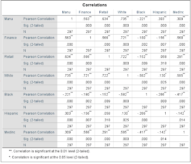 |
| Figure One: Correlation Matrix |
For part one I looked at spatial correlation using data given by the instructor of the Census Tract and population data in Milwaukee, WI. We used SPSS to calculate, and derived results were given to analyze the correlations between various fields such as white population, number of retail employees, black population, number of finance employees, Hispanic population, and the median household income. To focus on strength, direction, and probability, I will explain patterns that stand out upon examination.
There is a very high value of .735 (close to 1) pertaining to manufacturing employees that are white. This is a strong representation of a strong correlation making these two variables more linear if you were to observe them on a scatter-plot. On the contrary, the correlation between black and white populations is -0.0582, which shows a much weaker (negative) correlation. The negative value also represents a change in direction if you were to graph this. These two examples give you a better idea of certain jobs that are done by certain people. Based off these correlation numbers, you can say that black people have a lower probability of working manufacturing jobs than white people do. Furthermore, the negative values across the board for black people are also related to the negative value for median income, likely due to the lack of manufacturing, retail, and finance jobs in those geographic locations that blacks live in.
Part Two:
Introduction
For part two, I focused on spatial autocorrelation, and GeoDa assisted in gathering and displaying data. Data was given from the Texas Election Commission (TEC) for the 1980 and 2017 Presidential Elections. I was to analyze the patterns in order to know if there are any clustering of voting patterns in the state, as well as voter turnout for each election. I was also to find out if any election patterns had changed or not over 36 years. In addition, election and population data was analyzed to see if there is clustering of Hispanic populations in Texas.
Methodology
TEC provided the election data for 1980 and 2017 elections, but the population data needed to be downloaded from the U.S. Census website as well as a shapefile of Texas with counties. The population data downloaded was extremely cluttered, resulting in deletion of all the fields except for the geo-id field and the percent of Hispanic population field. Then, the Hispanic population data was joined to the Texas shapefile in ArcMap and exported as a new feature in order to open it up in GeoDa. Once GeoDa was opened, the shapefile was opened and a new "weights manager" was created as well as the addition of the "ID" variable. After that, the "Moran's scatter plot" could be created as well as a LISA cluster map. Upon completion, I could get a scatter plot and a cluster map that showed spatial autocorrelation of all the variables provided in the assignment directions. The results of running those tools in GeoDa consisted of of a scatter plot and a cluster map (comparisons between each were made) for the following variables: voter turnout in 1980, voter turnout in 2016, % democratic vote in 1980, % democratic vote in 2016, as well as Hispanic Population 2015.
Results
1980 Voter Turnout
The map and scatter plot below depict voter turnout in 1980. The dark red areas show counties that have a high-high relationship, meaning these counties have high voter turnout, as well as the bordering countries that are red in those respective clusters. The light red counties are counties that have high voter turnout, but are surrounded by counties that have a lower voter turnout around them. the dark blue counties represent counties that have low voter turnout that are surrounded by other counties with low voter turnout. Finally, the light blue counties are counties that have high voter turnout, but are surrounded by counties with low voter turnout. There is a significant low-low cluster in the southern part of Texas, and that could be likely due to overall low population in that area or improper counting.
 |
| Map One: voter turnout for 1980 |
 |
Graph One: voter turnout for 1980
|
2016 Voter Turnout
Voter turnout in 2016 has some slight changes from voter turnout in 1980; however, it's notable that the southern part of the state still has a low-low relationship among voter turnout, meaning those counties have low voter turnout surrounded by counties with low voter turnout. Furthermore, In the north, there is significantly less high-high relationships in 2016 than there was in 1980. Lastly, there is a new cluster that emerged in 2016 among low-low counties, and that is in the northwestern part of the state in comparison with that same geographic region in 1980 having no low-low relationships.
 |
| Map Two: voter turnout in 2016 |
 |
| Graph Two: voter turnout in 2016 |
1980 % Democratic Vote
Moving onto % of democratic vote in 1980, and we see some new patterns within the state of Texas. While the colors in this map (map three) mean the same thing as the maps in voter turnout, the map depicts the percentage of democratic vote. Some notable patterns of clusters are shown here in 1980 among percentage of democratic vote. For example, the whole western and northwestern part of the state have a low-low relationship, which also implies counties that have a low percentage of democratic votes surrounded by counties that also have a low percentage of democratic votes. There is a large cluster of high-high counties in the south, as well as as two smaller clusters in the northeast part of the state as well as the Houston area in Texas. The large high-high cluster in the southern part of the state can likely be attributed to the high % of Hispanic residents (in comparison to other ethnic minorities) in those counties. Hispanic residents are much more likely to vote democratic.
 |
| Map Three: % democratic vote 1980 |
 |
| Graph Three: % democratic vote 1980 |
2016 % Democratic Vote
Here in 2016 there is a large one large connected cluster of a low-low relationship that starts in the northern part of the state and that extends south to the central part of the state. This shows a new pattern that maintained it's northern proximity that existed in 1980, but this new pattern in 2016 shifted eastward. In 2016 there is still a large percentage of democratic votes depicted by the high-high cluster in the southern part of the state, as well as a new cluster in the southwestern part of the state in the El Paso Region. This new pattern in the El Paso Region did not exist in 1980, which was before the 1986 Immigration Reform Act (IRCA) passed by Ronald Reagan. It's likely that IRCA caused a influx of Hispanic voters to immigrate legally to this part of the state (El Paso) between 1986 and 2016, causing a new cluster that is shown below. Remember, Hispanics are more likely to vote democratic.
 |
| Map Four: % democratic vote 2016 |
 |
| Graph Four: % democratic vote 2016 |
Hispanic Population
Lastly, the map below shows a cluster map of Hispanic population per county in Texas. There is a enormous cluster of a high-high relationship ranging from the southern part of the state that goes northwest to the El Paso region. In the northeast part of the state, excluding the Dallas Fort-Worth area, there is an enormous cluster of low-low relationship that depicts low Hispanic population per county in the whole eastern region of Texas. This doesn't necessarily mean there's a low Hispanic population; however, when competing with other ethnic groups in those counties such as white and African-American, you're more likely to get a low-low relationship as shown below.
 |
| Map Five: Hispanic population |
 |
| Graph five: Hispanic population |
Conclusion
I found there are clusters of voting patterns in Texas that are significant. Some clusters are stronger than others based on the differences in data from 1980 and 2016. Voter turnout in both 1980 and 2016 was low in the southern part of the state. Percentage of democratic votes in 1980 and 2016 both had strong and large clusters, but one main difference was that the eastward shift of the low-low cluster in the northern part of the state from 1980 to 2016. Also, a notable difference was the addition of the high-high cluster in the El Paso Region that emerged in 2016. Lastly, based on the final map,(map five) it's clear that there is a high Hispanic population in the south-southwest part of Texas. This helped explain why the southern part of the state had clusters that showed high percentages of democratic voter turnout in the southern part in 2016.
No comments:
Post a Comment