Wednesday, May 10, 2017

Assignment 6 - Regression Analysis

Regression Analysis 

Introduction

The purpose of this assignment is to learn how to run a regression in SPSS, interpret regression analysis, and to predict results using regression.  Another purpose of this assignment is to learn how to effectively map standardized  residuals in ArcGIS and connect statistics and spatial outputs.  There were two separate parts to this assignment, the first using Excel and SPSS to conduct regression analysis to see if crime rates per 100,000 are dependent on free school lunches within town X. Then, using the regression equation, an estimate was made for the crime rate of a town that that had 23.5% of students receiving free lunch.

Part two entails using single linear regression, multiple linear regression, and residual analysis to assist the City of Portland in seeing what demographic variables influence 911 calls as well as helping a private construction company determine the most suitable location for the construction of a new hospital.

Part one: Crime and Free Student Lunches

Methodology:

A local news station claims that as free lunch increases, crime rate also goes up.  Finding out of this new claim is correct or false would be done using the Excel data titled "Crime," and running a regression analysis in SPSS.  Then, using the outputs for the analysis, we can interpret  and explain the data as seen below in figure 1.

* It's important to note that free student lunches are the independent variable and that crime rate is the dependent variable. This helps us determine if rates of free lunch (independent variable) influences crime rates (dependent variable).

Questions to be answered:

1. Is the news station's claim correct using SPSS?

2. If a new area of town was identified as having 23.5% with a free lunch, what would the corresponding crime rate be?

3. How confident are you with the results of question 2?
Figure 1: SPSS regression analysis results for the provided crime data


SPSS Output Results and Conclusion


The Model Summary table gives an r^2 value of .173, which is very far from 1, indicating a weak relationship.  The r^2 value explains how much the independent variable (PerFreeLunch) explains the dependent variable (CrimeRate) on a scale of 0-1, 0 showing no explanation and 1 showing full explanation.  In other words, since the r^2 value is .173, the percent of free lunches only explains 17.3% of the crime rate. 

Using a regression equation of y = a + bx format was the next step in understanding the crime rate in a new area of town and identified with 23.5% free lunches.  Y represents the dependent variable, a represents the constant (the point where the best fit line crosses the y axis or when x = 0),  x represents the independent variable, and b represents the slope of the line or the regression coefficient.  With this equation, an estimation of the crime rate can be calculated.  Y = 21.819  + 1.685 * 23.5%.  The equation indicates that if a town has a free student lunch rate of 23.5%, its' estimated crime rate using the regression equation is 61.417 per 100,000 people.  

The significance level in the PerFreeLunch row under Coefficients table is .005, indicating that there is a statistical relationship between crime rate and free student lunch rate which is significant at the 95% level.  The reason there is a statistical relatipnship is because of the significant level is below .05, we reject the null hypothesis (which states there is no relationship) and accept the alternative, which states there is a relationship.  In essence, the news station is technically right when it claims that as free lunch rate goes up, crime goes up.

Lastly, there is little confidence  in the results of 61.417 crimes out of 100,000 people because the r^2 value of .173 is low.

Part Two: Portland 911 Calls and Potential New Hospital Location

We were provided the following scenario: 

"The City of Portland is concerned about adequate responses to 911 calls.  They are curious what factors might provide explanations as to where the most calls come from.  A company is interested in building a new hospital and they are wondering how large an ER to build and the best place to build it."

Methodology:

Step 1: Single Regression in SPSS  

We were to choose three independent variables of our own choice to compare with the dependent variable of Calls (number of 911 calls).  I chose LowEduc, Unemployed, and ForgnBorn and ran three seperatesingle regression analysis against the dependent variable of Calls.  LowEduc represented the number of people without a high school diploma.  Jobs represented the number of jobs in the census tract.  ForgnBorn represented foreign born population.  After running a single regression analysis, we will be able to show how well the independent variable explains the number of 911 calls

Step 2: Run Multiple Regression in SPSS 

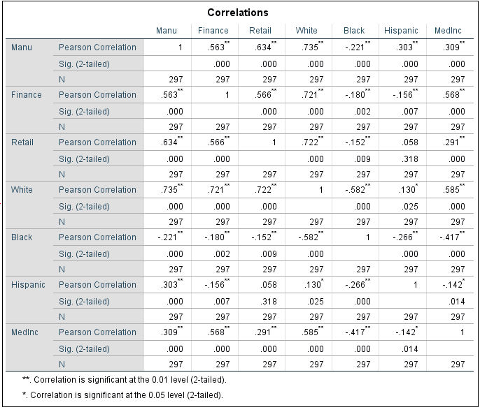
I ran a multiple regression analysis using the independent variables of Jobs, Renters, LowEduc, AlcoholX, Unemployed, FornBorn, Med Income, and CollGrads.  Again, the dependent variable was number of 911 calls.  * I included the option of collinearity diagnostics while running the analysis.  

Step 3: Stepwise Approach with Multiple Regression

The stepwise approach is used to find the variables that influence the linear equation the most.  With it, you're able to find independent variables to take out and SPSS automatically chooses the variables it things influence the equation the most.  For this particular approach, the computer chose Renters, lowEduc, and Jobs as the three variables which influence the linear equation the most.


Step 4: Choropleth Map and Residual Map

I opened Arcmap in order to map the number of 911 calls per census tract and added the Portland census tract layer. I then went into symbology and changed it to choropleth map of 911 calls.  

 I then mapped the residuals by going into the toolbox and going to the spatial statistics.  After getting to spatial statistics, I selected modeling spatial relationships and chose ordinary least squares (OLS).  I then selected the census tract as an input and set the unique field id to UniqID and set the dependent variable to number of calls as well as the independent variable to LowEduc.  


Results:

Single Variable Regression

LowEduc Independent Variable

Figure 2: Regression analysis output for 911 calls and LowEduc
The above image (figure 2) shows that there is positive relationship between 911 calls and the LowEduc variable based on the linear equation of y = 3.931+ .166x, meaning that 911 calls will increase by .166 for each new uneducated person in that area.  Additionally, the r^2 value for this regression is .567, which is a relatively high r^2 value.  Again, this means that 911 calls by LowEduc people is 56.7% of the time.  When it comes to hypothesis testing, we reject the null hypothesis because the significance level is under .05 meaning there is not a relationship between 911 calls and uneducated people.  In this case, we're in favor of the alternative, which says there is a relationship between 911 calls and uneducated people.

Unemployed Independent Variable


Figure 3: Regression analysis for 911 calls and Unemployed
Above (figure 3) shows that the equation of y=1.106+.507x can be helpful by looking at the slope of the equation which is .507.  This mean that 911 calls will increase by .507 for every unit increase in unemployment.  Additionally, the r^2 of .543 is relatively high.  Unemployment rate explains 54.3 % of the calls in the census tracts.  The significance level of .000 is under .05 so the null hypothesis would be rejected. This means we reject the null hypothesis that there is no relationship between unemployment rate and 911 calls and instead favor the alternative hypothesis which says that there is a relationship between the unemployment rate and 911 calls.


Foreign Born
Figure 4: Regression analysis for 911 calls and foreign born
The above image (figure 4) shows that the r^2 value is .552 which indicates that there is a relatively strong relationship between foreign born individuals and the number of 911 calls.  It also means that 55.2% of the foreign born citizens can help explain the variation in the number of 911 calls.  Since the significance level is .000 we reject the null saying that there is no relationship and instead favor the alternative saying that there is a relationship between the number of 911 calls and number of foreign born citizens.  Lastly, the B value of foreign born persons of .08 says that for every time there is one more foreign citizens in a census tract, the number of 911 calls will increase by .08 calls.

* All three of these outputs help understand if there is relationships between the dependent variable and the independent variables, it doesn't do a good job of helping the construction company decide a new place for a hospital.  


Multiple Regression

This part of step two dealt with multiple regression. A multiple regression analysis was performed on the data and also included collinearity diagnostics which was under the statistics setting.  The number of 911 still was the dependent variable, but multiple independent  variables were used, hence the name multiple regression analysis.  The outputs can be seen below in figures 5 and 6.


Figure 5: Multiple regression output 1

Figure 6: Multiple regression analysis output 2
The above outputs from figures 5 and 6 have an r^2 value of .783 which is fairly high, indicating that all of the variable explain 78.3% of the 911 calls. In order to find  the most influential variable, look in the "Beta" column under the Coefficients table.  You notice that LowEduc has the highest value, and unemployed has the lowest value.  The higher the value, the more influential the variable is; thus, LowEduc is the most influential and unemployed is the least influential.  

Additionally, looking at collinearity can be seen by looking at the bottom of of the Collinearity Diagnostics table.  The eigen values close to 0 tell you to investigate farther onto the condition index.  If the condition index is higher than 30, then there is collinearity.  When there is collinearity, a variable needs to be eliminated.  Fortunately, in this case, no values under the condition index are above 30 which means there is no collinearity.  If collinearity was present, you would then take the variable with the value on the bottom row closest two 1, eliminate it, and re-run the multiple regression analysis.  


Multiple Regression Analysis with Stepwise Approach


The below images, images 7,8, 9, and 10 are all the outputs from the stepwise multiple regression.  In stepwise regression, only the variables that aren't collinear will be used.  In other words, the stepwise method effectively eliminates the collinear variables in the process of computing the results.

The three variables that helped drive the equation most were Renters, LowEduc, and Jobs.  The r^2 values of these three variables combined was .771 as seen on the Model Summary of figure 7.  Again, those three variables help explain 77.1% of the 911 calls made.  When assessing this in a linear equation, I used 911 calls = Renters*.024+LowEduc*.103+Jobs*.004.  All these variables had a positive slope which means they all had a positive relationship with the amount of 911 calls made.


 Lastly, looking at the "Beta" values helps explain which variable is most influential and which variable is least influential.  The stepwise approach helps you see which Beta values are the highest, with LowEduc, being the highest, Jobs, being the second, and Renters being the third among the three.


Figure 7: Stepwise output 1

Figure 8 (below) shows the coefficients table.  The most important part of this table is in section 3, which places all three variables together.  Here, all the significance levels are under .05, indicating that the null hypothesis is rejected and that there is a relationship between these three independent variables (Renters, LowEduc, and Jobs)  with the number of 911 calls.
Figure 8: Stepwise output 2


Figure 9 (below) shows the variables that were not included in the stepwise output.  The variables  AlcoholX, Unempolyed, ForgnBorn, MedIncome, and CollGrads were those variables.
Figure 9: Stepwise output 3

Figure 10: Stepwise output 4

Maps


Figure 10 below shows the map depicting 911 calls per census tract in Portland Oregon to help better understand spatially where all the calls are coming from.  This map didn't have to be standardized to population because each census tract populates the same number of people.  We see a couple notable clusters  of tracts showing where the calls are coming from.  The cluster of 5 tracts in the north-central part of this map have between 57 and 176 calls from 911.  Also, the large tract in the southeast part of the city receives a high amount of 911 calls.  The center of the map receives a medium amount of calls, between 19 and 56.

This map also helps show the construction company which area to choose a location for the new hospital.  The most suitable location appears to be in the middle of the cluster of the 5 tracts in the north-central part of this map.  That way,  emergency services could respond faster to where the majority of 911 calls are coming from.   
Figure 10 - Number of 911 Calls per Census Tract in Portland, Oregon


*For the map below, I used the LowEduc variable, because it has the highest r^2 value.

Figure 11 below shows the standard deviations of the residuals for the LowEducvariable.  A residual is the amount of deviation of each point from the best fit line (or regression line).   This map shows how the independent variable (LowEduc) predicts the dependent variable (911 calls).

The equation 911 calls = .166* LowEduc + 3.931 predicts the number of 911 calls.  The darker the red and darker the blue, the worse the equation did at predicting the number of 911 calls.  Census tracts in red are where there's a higher standard deviation of residuals, meaning that the regression equation under-predicted the number of 911 calls in these areas.  The census tracts in blue were the areas that had a lower standard deviation of the residuals, meaning that the regression equation over-predicted the number of 911 calls in these areas.

 The more yellow a census tract is, the better job the equation did at predicting the number of 911 calls for that particular census tract.

*  Some of the census tracts in this map such as the two dark red tracts also overlap the same census tracts that received a high number of 911 calls in the chloropleth map.
Figure 11: Low Education Residual Map


Figure 12 - Renters, Low Education, and Jobs Map
The above map (figure 12) shows the residuals by census tract of the variables Renters, LowEduc, and Jobs.  The same interpretation of results can be applied here as figure 11, but with different tracts.  Blue tracts represent tracts where the model over-predicts the number of 911 calls.


Conclusion:
Part two of the assignment explained single regression, residuals, and multiple regression while using data from Portland Oregon as an example.  The data from SPSS as well as the maps created in ArcMap helped me determine a suitable area for a new hospitable to be built, which was in the central part of Portland, where the majority of 911 calls were coming from.

Throughout the assignment, there was a slight difference between the methods of regression analysis performed.  The multiple regression using the enter method used all of the variables and showed how factors, like multcollinearity can influence the results making them less accurate than the stepwise method.  In the end, both methods resulted in the showing of the independent variable that influenced where the 911 calls came from.


Monday, April 24, 2017

Assignment 5 - Correlation and Spatial Autocorrelation

Introduction:

The purpose of this assignment was to familiarize ourselves with correlation and spatial autocorrelation using SPSS and GeoDa software.  Part one used Census Tract data in Milwaukee and part two used election and population date among Hispanics in Texas to analyze and interpret the spatial autocorrelation of voter turnout in 1980 and 2016, % democratic voters in 1980 and 2016, and Hispanic population per county in Texas.

Part One: Correlation
Figure One: Correlation Matrix


For part one I looked at spatial correlation using data given by the instructor of the Census Tract and population data in Milwaukee, WI.  We used SPSS to calculate, and derived results were given to analyze the correlations between various fields such as white population, number of retail employees, black population, number of finance employees, Hispanic population, and the median household income.  To focus on strength, direction, and probability, I will explain patterns that stand out upon examination.

There is a very high value of .735 (close to 1) pertaining to manufacturing employees that are white. This is a strong representation of a strong correlation making these two variables more linear if you were to observe them on a scatter-plot.  On the contrary, the correlation between black and white populations is -0.0582, which shows a much weaker (negative) correlation.  The negative value also represents a change in direction if you were to graph this.  These two examples give you a better idea of certain jobs that are done by certain people. Based off these correlation numbers, you can say that black people have a lower probability of working manufacturing jobs than white people do.  Furthermore, the negative values across the board for black people are also related to the negative value for median income, likely due to the lack of manufacturing, retail, and finance jobs in those geographic locations that blacks live in.

Part Two:

Introduction

For part two, I focused on spatial autocorrelation, and GeoDa assisted in gathering and displaying data.  Data was given from the Texas Election Commission (TEC) for the 1980 and 2017 Presidential Elections.  I was to analyze the patterns in order to know if there are any clustering of voting patterns in the state, as well as voter turnout for each election.  I was also to find out if any election patterns had changed or not over 36 years.  In addition, election and population data was analyzed to see if there is clustering of Hispanic populations in Texas.

Methodology

TEC provided the election data for 1980 and 2017 elections, but the population data needed to be downloaded from the U.S. Census website as well as a shapefile of Texas with counties.  The population data downloaded was extremely cluttered, resulting in deletion of all the fields except for the geo-id field and the percent of Hispanic population field.  Then, the Hispanic population data was joined to the Texas shapefile in ArcMap and exported as a new feature in order to open it up in GeoDa.  Once GeoDa was opened, the shapefile was opened and a new "weights manager" was created as well as the addition of the "ID" variable.  After that, the "Moran's scatter plot" could be created as well as a LISA cluster map.  Upon completion, I could get a scatter plot and a cluster map that showed spatial autocorrelation of all the variables provided in the assignment directions.  The results of running those tools in GeoDa consisted of of a scatter plot and a cluster map (comparisons between each were made) for the following variables: voter turnout in 1980, voter turnout in 2016, % democratic vote in 1980, % democratic vote in 2016, as well as Hispanic Population 2015.

Results

1980 Voter Turnout

The map and scatter plot below depict voter turnout in 1980.  The dark red areas show counties that have a high-high relationship, meaning these counties have high voter turnout, as well as the bordering countries that are red in those respective clusters.  The light red counties are counties that have high voter turnout, but are surrounded by counties that have a lower voter turnout around them.  the dark blue counties represent counties that have low voter turnout that are surrounded by other counties with low voter turnout.  Finally, the light blue counties are counties that have high voter turnout, but are surrounded by counties with low voter turnout.    There is a significant low-low cluster in the southern part of  Texas, and that could be likely due to overall low population in that area or improper counting.
Map One: voter turnout for 1980
Graph One: voter turnout for 1980

2016 Voter Turnout

Voter turnout in 2016 has some slight changes from voter turnout in 1980; however, it's notable that the southern part of the state still has a low-low relationship among voter turnout, meaning those counties have low voter turnout surrounded by counties with low voter turnout. Furthermore,  In the north, there is significantly less high-high relationships in 2016 than there was in 1980.  Lastly, there is a new cluster that emerged in 2016 among low-low counties, and that is in the northwestern part of the state in comparison with that same geographic region in 1980 having no low-low relationships.


Map Two: voter turnout in 2016


Graph Two: voter turnout in 2016


1980 % Democratic Vote

Moving onto % of democratic vote in 1980, and we see some new patterns within the state of Texas.  While the colors in this map (map three) mean the same thing as the maps in voter turnout, the map depicts the percentage of democratic vote.  Some notable patterns of clusters are shown here in 1980 among percentage of democratic vote.  For example,  the whole western and northwestern part of the state have a low-low relationship, which also implies counties that have a low percentage of democratic votes surrounded by counties that also have a low percentage of democratic votes.  There is a large cluster of high-high counties in the south, as well as as two smaller clusters in the northeast part of the state as well as the Houston area in Texas.  The large high-high cluster in the southern part of the state can likely be attributed to the high % of Hispanic residents (in comparison to other ethnic minorities) in those counties.  Hispanic residents are much more likely to vote democratic.


Map Three: % democratic vote 1980


Graph Three: % democratic vote 1980


2016 % Democratic Vote

Here in 2016 there is a large one large connected cluster of a low-low relationship that starts in the northern part of the state and that extends south to the central part of the state.  This shows a new pattern that maintained it's northern proximity that existed in 1980, but this new pattern in 2016 shifted eastward.  In 2016 there is still a large percentage of democratic votes depicted by the high-high cluster in the southern part of the state, as well as a new cluster in the southwestern part of the state in the El Paso Region.   This new pattern in the El Paso Region did not exist in 1980, which was before the 1986 Immigration Reform Act (IRCA) passed by Ronald Reagan.  It's likely that IRCA caused a influx of Hispanic voters to immigrate legally to this part of the state (El Paso)  between 1986 and 2016, causing a new cluster that is shown below.  Remember, Hispanics are more likely to vote democratic.


Map Four: % democratic vote 2016


Graph Four: % democratic vote 2016

Hispanic Population

Lastly, the map below shows a cluster map of Hispanic population per county in Texas.  There is a enormous cluster of a high-high relationship ranging from the southern part of the state that goes northwest to the El Paso region.  In the northeast part of the state, excluding the Dallas Fort-Worth area, there is an enormous cluster of low-low relationship that depicts low Hispanic population per county in the whole eastern region of Texas.  This doesn't necessarily mean there's a low Hispanic population; however, when competing with other ethnic groups in those counties such as white and African-American, you're more likely to get a low-low relationship as shown below.
Map Five: Hispanic population


Graph five: Hispanic population
Conclusion

I found there are clusters of voting patterns in Texas that are significant.  Some clusters are stronger  than others based on the differences in data from 1980 and 2016.  Voter turnout in both 1980 and 2016 was low in the southern part of the state.  Percentage of democratic votes in 1980 and 2016 both had strong and large clusters, but one main difference was that the eastward shift of the low-low cluster in the northern part of the state from 1980 to 2016.  Also, a notable difference was the addition of the high-high cluster in the El Paso Region that emerged in 2016.  Lastly, based on the final map,(map five) it's clear that there is a high Hispanic population in the south-southwest part of Texas.  This helped explain why the southern part of the state had clusters that showed high percentages of democratic voter turnout in the southern part in 2016.


Thursday, April 6, 2017

Assignment 4

Goals and Background

The purpose of the following assignment is to understand "z" and "t" tests and how they're different.  Also, learning how to calculate a "z" and "t" test, using steps of hypothesis testing, making decisions about the null and alternative hypotheses, as well as using real-world data to connect statistics and geography.  

Steps of hypothesis testing are below:
  1. State the null hypothesis
  2. State the alternative hypothesis
  3. Choose a statistical test
  4. Choose the significance level (α)
  5. Calculate test statistic
  6. Make a decision about the null & alternative hypothesis

Null Hypothesis

A null hypothesis states there is no difference between the sample mean (derived from personal data) and the mean of the entire population which you are comparing the data against. 

Alternative Hypothesis

A alternative hypothesis states there is  difference between the sample mean (derived from personal data) and the mean of the entire population which you are comparing the data against.

The null null or alternative hypothesis only tells you if there is a difference, but not how much the difference is.  

We either reject, or fail to reject the null hypothesis and never accept the null hypothesis.  


Question 1

We were given a chart that gave the  interval type, confidence interval or level, and the number of test samples. Then I  determined which test type was appropriate and the Significance Level (α).  Two-tailed tests had 2 z or t values.  

Question 2

Dr. Weichelt provided the following question and directions:

1.       A Department of Agriculture and Live Stock Development organization in Kenya estimate that yields in a certain district should approach the following amounts in metric tons (averages based on data from the whole country) per hectare: groundnuts. 0.57; cassava, 3.7; and beans, 0.29.  A survey of 23 farmers had the following results:

μ             σ
                Ground Nuts      0.52        0.3
                Cassava                3.3          .75
                Beans                    0.34        0.12
                
a.       Test the hypothesis for each of these products.  Assume that each are 2 tailed with a Confidence Level of 95% *Use the appropriate test
b.       Be sure to present the null and alternative hypotheses for each as well as conclusions
c.       What are the probabilities values for each crop? 
d.       What are the similarities and differences in the results

I then followed the appropriate steps for hypothesis testing to answer the questions.

1) State the null hypothesis for each of the three crops. Ground Nuts, Cassava, and Beans.
2) State the alternative hypothesis for all three crops.
3) Choose a statistical test based on (n). 
4) Choose the significant level  (α)
5) Calculate the test statistic 
6) Make a decision about the null and alternative hypothesis based on where they fall. 
   
Ground nuts:
Null hypothesis- There is no difference between the yield of ground nuts between the sample farmers and the county as a whole.
Alternative hypothesis: There is a difference between the yield of ground nuts between the sample farmers and the county as a whole.
Test statistic: (0.52-0.57)/(.3/sqrt 23)= .05/.063= -.794
Probability: .78344
-0.779 falls between -2.074 and 2.074 so for ground nuts, the null hypothesis will fail to be rejected.

Cassava:
Null hypothesis: There is no difference between the yield of cassava between the sample farmers and the county as a whole.
Alternative hypothesis: There is a difference between the yield of cassava between the sample farmers and the county as a whole.
Test statistic: (3.3-3.7)/(.75/sqrt 23) = .4/.156= -2.56
Probability: .5938
 -2.56 falls outside of -2.074 and 2.074 so for cassavas, the null hypothesis will be rejected.

Beans:
Null hypothesis: There is no difference between the yield of beans between the sample farmers and the county as a whole.
Alternative hypothesis: There is a difference between the yield of beans between the sample farmers and the county as a whole.
Test statistic: (0.34-0.29)/(0.12/sqrt 23) = .05/.025= 2
Probability: .96037
2 falls  between -2.074 and 2.074 so for beans, the null hypothesis will fail to be rejected.

Similarities:
The beans and ground nuts both failed to reject the null hypothesis. This  means that they both are not statistically different from the population mean. Another similarity is between ground nuts and cassava. Both of sample means for these two crops were lower than the population mean.

Differences:
The cassava was the one crop that rejected the null hypothesis.  Additionally, beans were the only crop that had a sample mean larger than the population mean.

Question 3

Dr. Weichelt provided the following question:

1.       A researcher suspects that the level of a particular stream’s pollutant is higher than the allowable limit of 4.2 mg/l.  A sample of n= 17 reveals a mean pollutant level of 6.4 mg/l, with a standard deviation of 4.4.  What are your conclusions?  (one tailed test, 95% Significance Level) Please follow the hypothesis testing steps.  What is the corresponding probability value of your calculated answer


1) There is no difference between the sample mean of the particular stream and the allowable limit of streams pollutant's.

2) There is a difference between the sample mean of the specific stream and the allowable limit of stream's pollutants.

3) Since (n) is 17, I will use a t-test because (n) is less than 30.

4) With a confidence interval of 95 %, and using a one-tailed test, the significant level is .05. Degrees of Freedom is equal to 1.746 ( 17-1 = 16).

5) t=(6.4-4.2)/(4.4/sqrt(17)) = 2.2/1.067 = 2.062

6) Since 2.062 is over 1.746, we reject the null hypothesis.  This meant there is no difference between the standard of the pollution samples and the allowable time limit for the stream.  

Part 2

For part two home values are compared between between block groups for the city of Ea Claire and blog groups for the county of Eau claire as a whole to see if home values for the city are different from the county.  Hypothesis testing was again used to determine the answer.  

1)  Null hypothesis: there is no difference between the home values for the city of Eau Claire and the county of Eau Claire.

2) Alternative: There is a difference between the home values for the city of Eau Claire and the county of Eau Claire.

3) (n) is 53, therefore we have to use a z-test.  

4) The confidence level was 95%, and I used a one-tailed test, so the significance level  (α) is .05. 

5) Test statistic:  z = ((151876.51-169438.13)/(49706.92/sqrt(53))=-17561.62/6827.77=-2.57

6) Since -2.57 falls out of -1.64, I rejected the null hypothesis.  


Thursday, March 9, 2017

Assignment 3

Goals and Background
The purpose and goals of this assignment are to investigate foreclosures in Dane County while using z-scores, probability, and the add field tool. Furthermore,  the experience acquired from this assignment in beneficial in helping to relate the calculated information (Z-Scores and Probability) to a situation for pattern analysis.

Key Terms

Z-Score: A Z-Score, also known as a standard score,  is a number that indicates how many standard deviations an element is from the mean and can be placed on a normal distribution.  Fig. 1 is the forumla for the Z score, where Zi: Z -score, Xi: number of observations minus the mean, divided by the standard deviation.

Figure 1: Z-Score Formula


Probability: Probability is the likelihood, by percent, that a numeric valued event will occur. The probability is derived from the z-score, then finding the Z-Score on a probability chart (Fig. 2). 


Probability Chart of Z-Scores

The Situation

      You have been hired by an independent research consortium to study the geography of foreclosures in a Dane County, Wisconsin.  County officials are worried about the increase in foreclosures from 2011 to 2012.  As an independent researcher you have been given the addresses of all foreclosures in Dane County for 2011 and 2012 and they have been geocoded and then added to the Census Tracts for Dane County.    While you realize that you cannot determine the reasons for foreclosures occurring, you do have the tools to analyze them spatially.  Specifically, you are interested to see how the patterns of these foreclosures have changed from one year to the next.  Explain what the patterns are and also provide some understanding as to the chance foreclosures will increase by 2013?  


After the calculation of the Z-Scores for the three tracts location in Dane County, a second question was given:

 If these patterns for 2012 hold next year in Dane County, based on this Data what number of foreclosures for all of Dane County will be exceeded 70% of the time?  Exceeded only 20% of the time?

Methods

First, a map was to be created displaying the change between 2011 and 2012 in foreclosures in Dane County, Wisconsin using ArcMap (Fig. 4).  A field was added to the attribute table, followed by using the field calculator to subtract the 2012 foreclosure value from the 2011 value.  The results offered a standard deviation classification and the ability to look at the differences between 2012 and 2011 regarding foreclosures in Dane County.

Next, the the instructions were to calculate the Z-Score for 3 specific tracts within Dane County (Fig. 3). Arcmap was then used to get the mean and standard deviation for both years of data.  The values for each three specific tracts from both years was plugged into Microsoft Excel, which was eventually used to calculate the the six Z-Scores using Excel ( Fig. 7).


Figure 3: Specific Dane County Tracts: 122.01, 114.01, & 31

Results

While examining Fig. 4, you can see the areas which have had a increase in foreclosures shown by the darker brown color on the outside of the map.  The areas with the green colors closer to the center of the county have seen a decrease in foreclosures since 2011.  It appears that areas outside of the central capital area in the center of the county are the areas that have faced higher foreclosure rates.  
Fig. 5 is a map showing the foreclosure value for 2011 accompanied with a standard deviation classification in the legend.  The standard deviation is needed to calculate the Z-Score for each of the three specific tracts.  Tract 114.01 has a higher amount of foreclosures compared to the county average.  Tract 122.01 has a lower number of foreclosures compared to the county average.  Tract 31 has a higher amount of foreclosures compared to the county average.  When comparing the results of Fig. 5 with the results of Fig. 4, it's notable that Tract 31 (in Fig. 5) has a higher than average amount of foreclosures, but in Fig. 4 there's a reduction in foreclosure numbers.  Similarly, the same thing appears in
Figure 5: 2011 Foreclosures
Fig. 6 is a map showing the foreclosure value for the year of 2012 with a standard deviation classification in the legend.  The results don't vary a lot between the three tracts; however, tract 31 did see a fair decrease from 2011 to 2012.
Figure 6: 2012 Foreclosures


Figure 7: Calculated Z-Scores of  three specific tracts from 2011 and 2012


Lastly, the second question that needs to be answered: 

If these patterns for 2012 hold next year in Dane County, based on this Data what number of foreclosures for all of Dane County will be exceeded 70% of the time?  Exceeded only 20% of the time?  

Foreclosures that had a Z-Score greater than -.52 will be exceeded 70% of the time.  This means that 70% of the time the foreclosures for a tract will exceed approximately 7.  

Foreclosures with a Z-Score greater than .84 will be exceeded only 20% of the time  This means that 20% of the time the foreclosures for a tract will exceed approximately 20.

Conclusion
There is a clear pattern of higher foreclosures on the outside of the county, surrounding the capital area of Dane County.  There isn't sufficient information to do a full analysis why the pattern is this way; however, there were some things uncovered that were significant. Around this time, the economy was recovering from a recession, and people who moved to the outskirts of Madison didn't anticipate problems such as a market crash.  In turn, this led to  rural areas outside of an urban area having a higher chance of having foreclosures as well as larger tracts because of the more expensive mortgages that come with suburban properties.  In order to find solution(s) for the high amount of foreclosures during this period, an investigation would have to be done to see how easy loans were given to these potential homeowners.  If the loans were given too easily, maybe the solution would be to make it harder to get loans for certain people.

Monday, March 6, 2017

Assignment 2 Geography 370

Goals and Background

The goal of the following assignment is to become familiar with a variety of statistical methods including Range, Mean, Median, Mode, Kurtosis, Skewness, and Standard Deviation. Furthermore, we will familiarize ourself with more programs such as MS Excel and ESRI Arc Map to help compute data we were given.

Definitions


Range

Range is the difference between the the largest value and the smallest value in a set of data. Example) say you had a data set of 1,3,5,7.  The range would be 7-1, which is 6.

Mean

Mean is average of all the numbers in a given data set. The mean is calculated by adding all of the numbers together and dividing the total by the total numbers of values in the data set. Example) 1,3,5,7.  1+3+5+7= 16.  16/4=4.  The mean is 4 in this data set.

Median

Median is the number which falls in the middle of a data set when put in order from smallest to largest. Example) 1,2,3,4,5.  3 is your median in this case.  If your data set has an even number of observations, you simply take the middle two values, add them together, and divide by 2.  Example) 1,2,3,4.  2+3=5.
5/2 =2.5.  2.5 would be the median in this case.  

Mode

Mode is the number which occurs most often in a data set. Example)  1,2,3,3,3,4,4,5,6.   In his case, 3 is the mode.  *Note* If there are two numbers that occur at the same frequency, then there can be two modes.


Skewness

Skewness describes the balance of the histogram compared to a normal distribution. There are 3 types of skewness: positive, no skew, and negative.  Positive skew is when the outliers in a data set are on the positive, or right side  of the mean (Fig.1). Negative skew is when the outliers in the data set are on the left side of the mean (Fig.1).  No skew means there is an even distribution of the data and the graph looks like a bell-shaped curve. 
Image result for positive, negative, and no skew
Figure 1: Images containing postive and negative skewness http://study.com/academy/lesson/skewness-in-statistics-definition-formula-example.html

Kurtosis describes the shape of the histogram whether its "steep," or "flat" o compared to the "normal distribution.There are 3 different ways to describe Kutosis: Leptokurtic, Mesokurtic, and Platykurtic.   Leptokurtic is a description of a very peaked or "steep" distribution. Mesokurtic is deemed to have a  "normal" distribution. Platykurtic is a short or a "flat" distribution. Additionally, Platykurtic is described as negative Kurtosis and Leptokurtic is positive Kurtosis. Figure 2 below is an example of the three types of Kurtosis. When analyzing Kurtosis calculations anything greater than 1 is Leptokurtic and below -1 is Platykurtic.

KurtosisPict
Figure 2: The forms of Kurtosis.  http://mvpprograms.com/help/mvpstats/distributions/SkewnessKurtosis

Standard Deviation

Standard Deviation is a statistical measurement which describes how spread out the numbers in a data set are from the mean. "1 Standard Deviation" from the mean is equal to 68.2% of the values in a data set. "2 Standard Deviations" from the mean is equal to 95.4% of the values in a data set.  "3 Standard Deviations" from the mean is equal to 99.7% of the values in a data set. 


Assignment Description - Part 1

We were given the following scenario by our professor:

Cycling is often seen as an individual sport, but it is actually more of a team sport.  You are looking to invest a large sum of money into a cycle team.  While having a superstar is nice and brings attention, having a better team overall will mean more money in your pocket.  In the last race in the TOUR de GEOGRAPHIA, the overall individual winner won $300,000, with only 25% going to the team owner, but the team that won, gained $400,000 in a variety of ways, with 35% going to the team owner.  
Using the incredible set of knowledge learned in your Quant Methods class at UWEC, you decide to put it to good use.  You have data (total time for entire race) for teams and individual racers over the last race held in Spain. To begin your investigation you are to analyze the race times of members from the team. Traditionally Team ASTANA has typically produced the race winner (meaning the rider that finishes first), but an up and coming group named Team TOBLER has been making waves on the cycling circuit.  

The questions that will be answered are as follows:

Should you invest in Team ASTANA or gamble on Team TOBLER?   Why did you pick one team over another?  What descriptive statistics do you think best help explain your answer?  Please explain your results using the statistics to support your answer **Please explain results in hours and mins. 


Methods

For this assignment I had to calculate the Range, Mean, Median, Mode, Kurtosis, Skewness, and Standard Deviation for the race times provided to me.The standard deviation was to be calculated by hand and shown on paper, as figures 3 and 4 provide the proof below.  The rest of the results could be calculated in MS Excel itself.

I first calculated the standard deviation of each team (Fig. 3-4) using the population standard deviation formula.  Figure 3 and 4 provide the work I did for both Team Tobler and Team Astana.  

 I then copied the provided data and imported it into Excel so I could sort the numbers in descending order.  After  that, I was able to calculate the 
Range, Mean, Median, Mode, Kurtosis, Skewness for each team using Excel and the results are shown below in table 1.

Displaying IMG_0355.JPG
Figure 3: Calculating the Standard Deviation of Team Tobler

Displaying IMG_0356.JPG
Figure 4: Calculating the Standard Deviation of Team Astana
Table 1 Results
Table 1

Discussion and Answer


It's hard to answer whether I'd invest in team Astana or gamble on Tobler.  Based on the results of the data set given, I would likely invest with team Astana because the mean is a very safe number.  However, this is the results of one race, and one race results isn't enough for me to make a solid decision on which team to invest money into.  
Some more reasons I would choose Team Astana over Team Tobler is that the total time (sum)  for Astana was equal to 569 hours and 10 minuets versus Tobler which had a total time of 571 hours and 21 minuets.  Team  Tobler had a lower standard deviation, meaning the team had fewer outliers and most the team finished around the same time.  In spite of the lower standard deviation, the majority of team Tobler finished behind team Astana. Team Astana had a higher standard deviation because of Racer K, who possibly had a bad day running, which in turn made Team Astanas standard deviation higher.  


Assignment Description - Part 2

For part 2 we are to calculate the mean center and weighted mean center for the population of Wisconsin by county for 2000 and 2015.  Before that, I will provide the important definitions for part 2 below.  
Mean Center

The mean center is the average location of points which have an X and a Y value and are plotted on a graph or Cartesian Plane.  


Weighted Mean Center


The weighted mean center is a set of points that is adjusted in order to influence a second value associated with each point.  The difference between this and mean center is that the points have weights or "frequencies" attached to them (Fig. 5)


Figure 5: Geographic Mean Centers of Wisconsin Population from 2000 and 2015.


Discussion and Conclusion


In the above map, you can see the mean center is centrally located in the state.  The mean center is calculated off of the center point of each county, which is why it is located in the center of the state. The weighted mean centers are still in central Wisconsin, but further south from the mean center.  That is because the weighted mean center takes the population of counties into account.  The more populated counties are all in the southern and southeast part of the state, specifically Milwaukee County and its' surrounding area.  You can see that the weighted mean center from 2015 is slightly west of the 2000 weighted mean center.   It appears that there has been a population shift from 2000 to 2015, possibly to get closer to other working centers such as La Crosse, or the Twin Cities in Minnesota.